2021
UX/UI Design for a Cosmetology Clinic Website
Client:
VERSHE Clinic
Visual Concept
Information architecture
CTA Design
Responsive Web Design

2021
UX/UI Design for a Cosmetology Clinic Website
Client:
VERSHE Clinic
Visual Concept
Information architecture
CTA Design
Responsive Web Design

2021
UX/UI Design for a Cosmetology Clinic Website
Client:
VERSHE Clinic
Visual Concept
Information architecture
CTA Design
Responsive Web Design

2021
UX/UI Design for a Cosmetology Clinic Website
Client:
VERSHE Clinic
Visual Concept
Information architecture
CTA Design
Responsive Web Design
2021
UX/UI Design for a Cosmetology Clinic Website
Client:
VERSHE Clinic
Visual Concept
Information architecture
CTA Design
Responsive Web Design
Overview
Overview
Overview
Overview
Overview
ABOUT VERSHE
The cosmetology clinic VERSHE offers a range of beauty and revitalization treatments, with a focus on the premium segment. The clinic can boast the most innovative equipment and highly qualified specialists.
ABOUT VERSHE
The cosmetology clinic VERSHE offers a range of beauty and revitalization treatments, with a focus on the premium segment. The clinic can boast the most innovative equipment and highly qualified specialists.
ABOUT VERSHE
The cosmetology clinic VERSHE offers a range of beauty and revitalization treatments, with a focus on the premium segment. The clinic can boast the most innovative equipment and highly qualified specialists.
ABOUT VERSHE
The cosmetology clinic VERSHE offers a range of beauty and revitalization treatments, with a focus on the premium segment. The clinic can boast the most innovative equipment and highly qualified specialists.
ABOUT VERSHE
The cosmetology clinic VERSHE offers a range of beauty and revitalization treatments, with a focus on the premium segment. The clinic can boast the most innovative equipment and highly qualified specialists.
CONTEXT
The clinic was planning to open for patients in autumn 2021. It was necessary beforehand to create a corporate website where future clients could find comprehensive information about the clinic and its services.
CONTEXT
The clinic was planning to open for patients in autumn 2021. It was necessary beforehand to create a corporate website where future clients could find comprehensive information about the clinic and its services.
CONTEXT
The clinic was planning to open for patients in autumn 2021. It was necessary beforehand to create a corporate website where future clients could find comprehensive information about the clinic and its services.
CONTEXT
The clinic was planning to open for patients in autumn 2021. It was necessary beforehand to create a corporate website where future clients could find comprehensive information about the clinic and its services.
CONTEXT
The clinic was planning to open for patients in autumn 2021. It was necessary beforehand to create a corporate website where future clients could find comprehensive information about the clinic and its services.
BUSINESS CHALLENGE
Offer detailed information about the clinic's services to potential clients.
Show the clinic's expertise to establish credibility and trust.
Encourage visitors to book appointments using the website.
BUSINESS CHALLENGE
Offer detailed information about the clinic's services to potential clients.
Show the clinic's expertise to establish credibility and trust.
Encourage visitors to book appointments using the website.
BUSINESS CHALLENGE
Offer detailed information about the clinic's services to potential clients.
Show the clinic's expertise to establish credibility and trust.
Encourage visitors to book appointments using the website.
BUSINESS CHALLENGE
Offer detailed information about the clinic's services to potential clients.
Show the clinic's expertise to establish credibility and trust.
Encourage visitors to book appointments using the website.
BUSINESS CHALLENGE
Offer detailed information about the clinic's services to potential clients.
Show the clinic's expertise to establish credibility and trust.
Encourage visitors to book appointments using the website.



Design process
Design process
Design process
Design process
Design process
DESIGN CONCEPT
In this project, the exploratory research primarily included a study of competitors, brand analysis, and desk research. After gathering insights, I developed a general design concept and presented it to the client through a video presentation. This step ensured that my design decisions matches the client's vision.
INFORMATION ARCHITECTURE
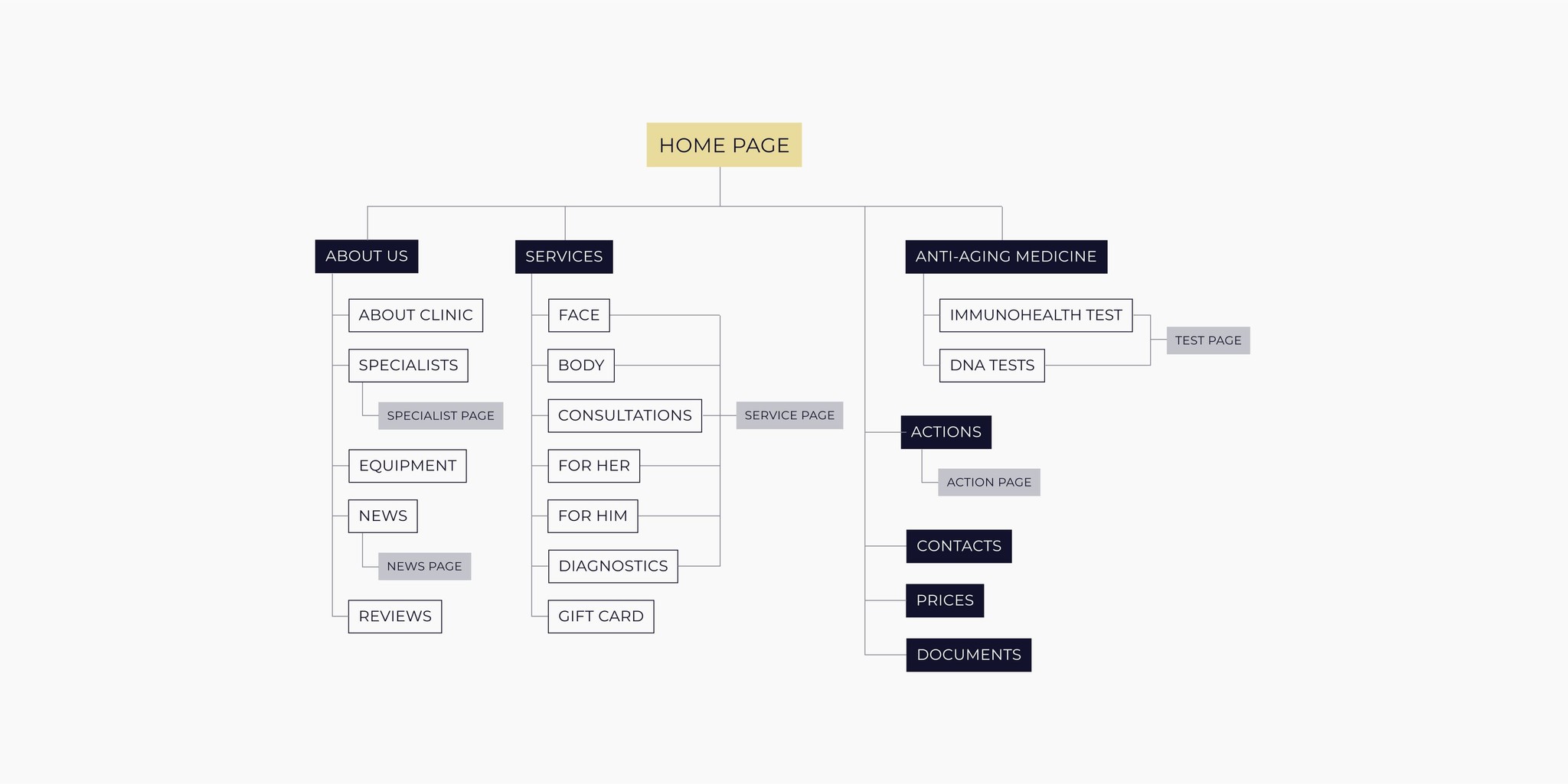
Building the information architecture was guided by the objectives of the website, industry best practices, and business priorities. One of the key selling points of VERSHE clinic was anti-aging medicine, so we highlighted this category by placing it in the first-level menu.
Sitemap

Sitemap

Sitemap

Sitemap

Sitemap
WIREFRAMING & PROTOTYPING
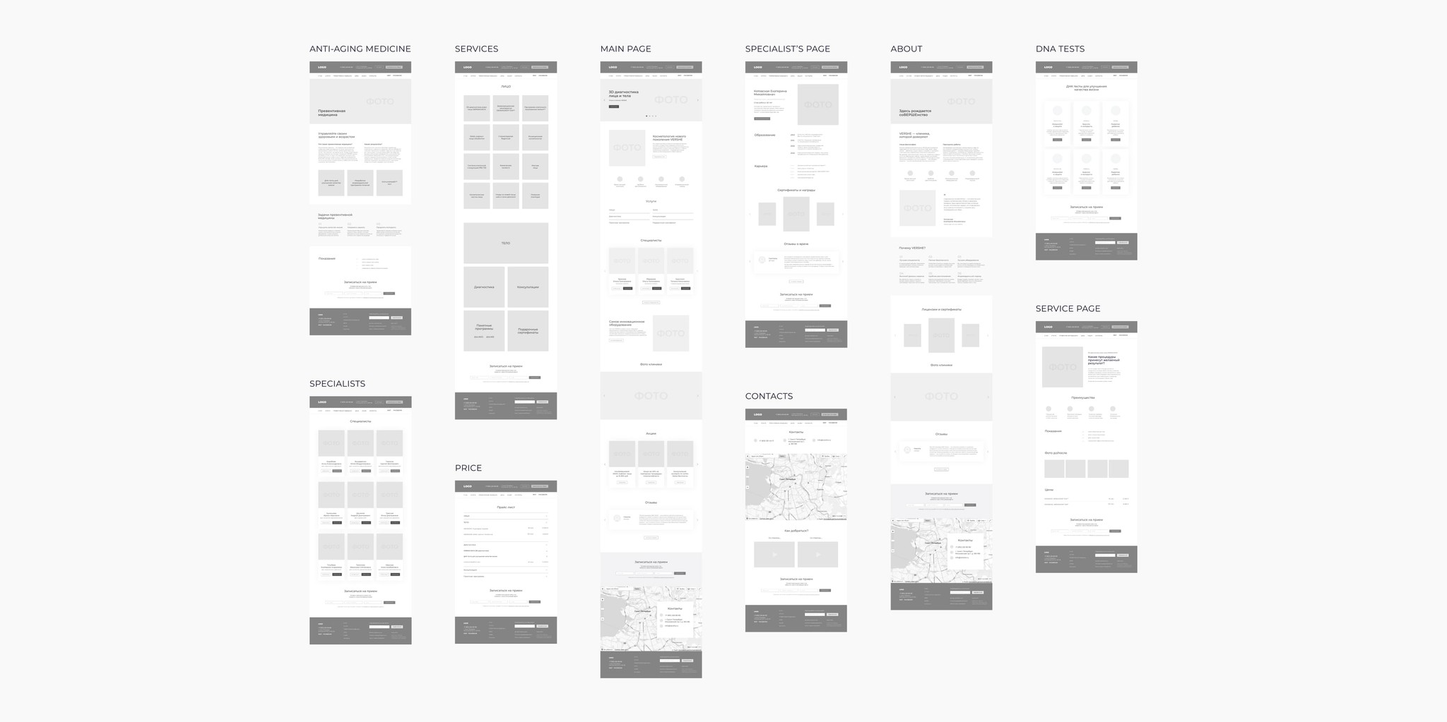
In total, I created more than 30 unique design prototypes. Short time frame and need to send designs to the developer page by page required thorough work on lo-fi prototypes that are an intermediate link between the information architecture and visual design of the site. Focus on lo-fi prototypes allow for faster and less expensive making changes than to the actual implementation.
Lo-Fi Prototypes

Lo-Fi Prototypes

Lo-Fi Prototypes

Lo-Fi Prototypes

Lo-Fi Prototypes
Solutions
Solutions
Solutions
Solutions
Solutions
1. Feeling of the brand through color and form
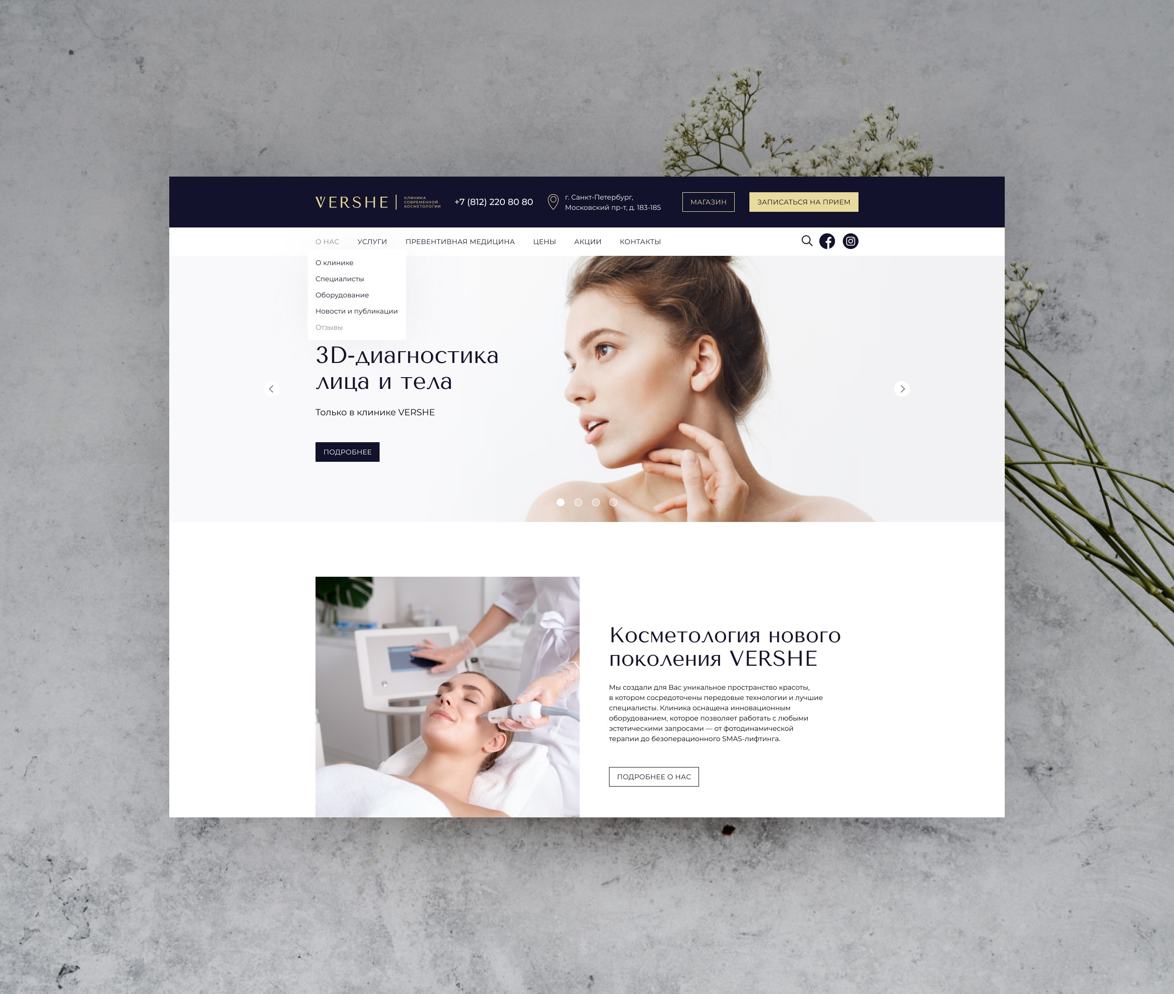
A strict, clean, and laconic design creates a feeling of premiumness and exclusivity.
The white background color shows sterility and safety. The brand blue and gold colors emphasize high status.
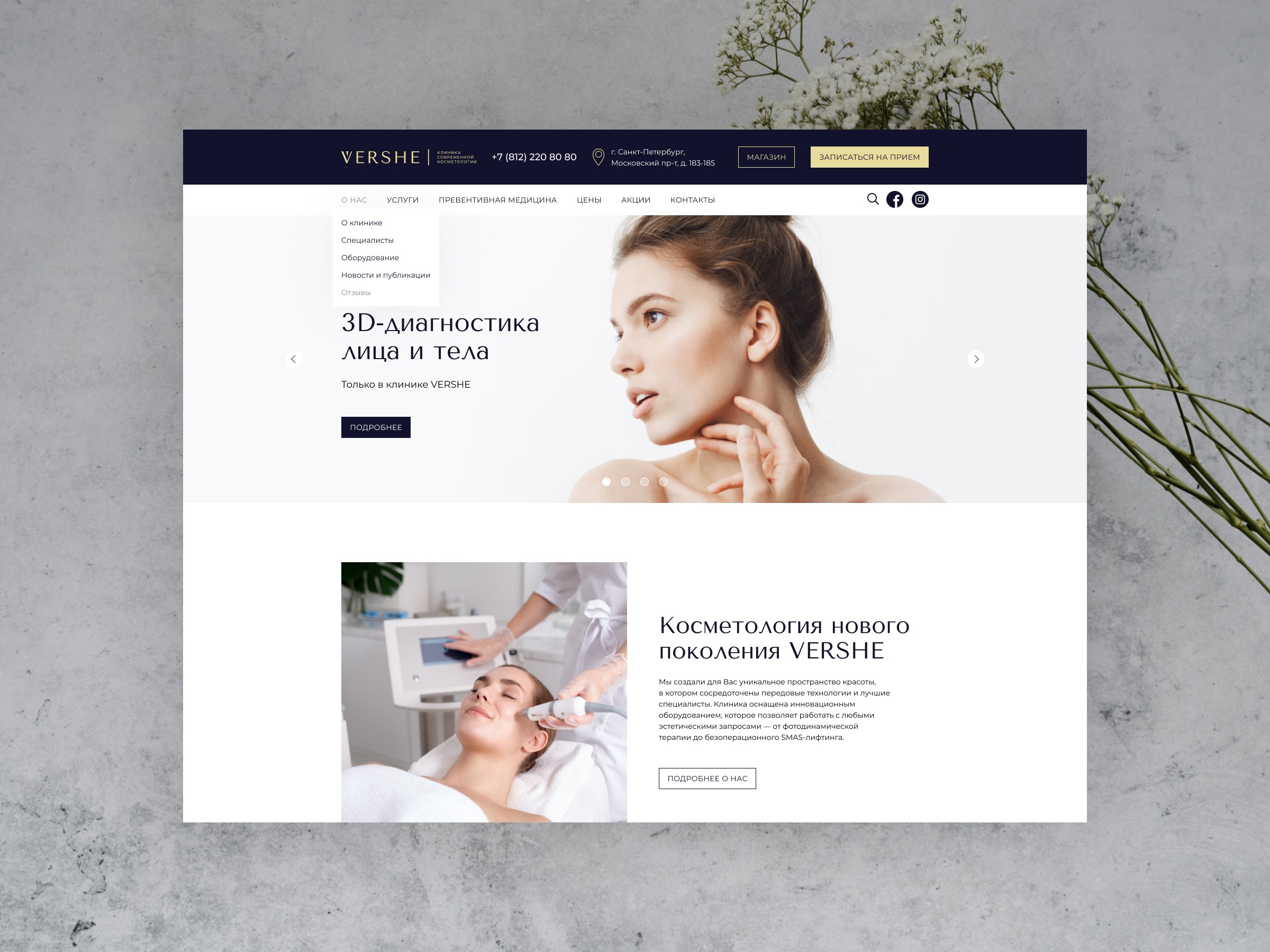
Focus on high-quality images. This is especially important for a cosmetology clinic, as clients are looking for a professional provider for their beauty and wellness needs.
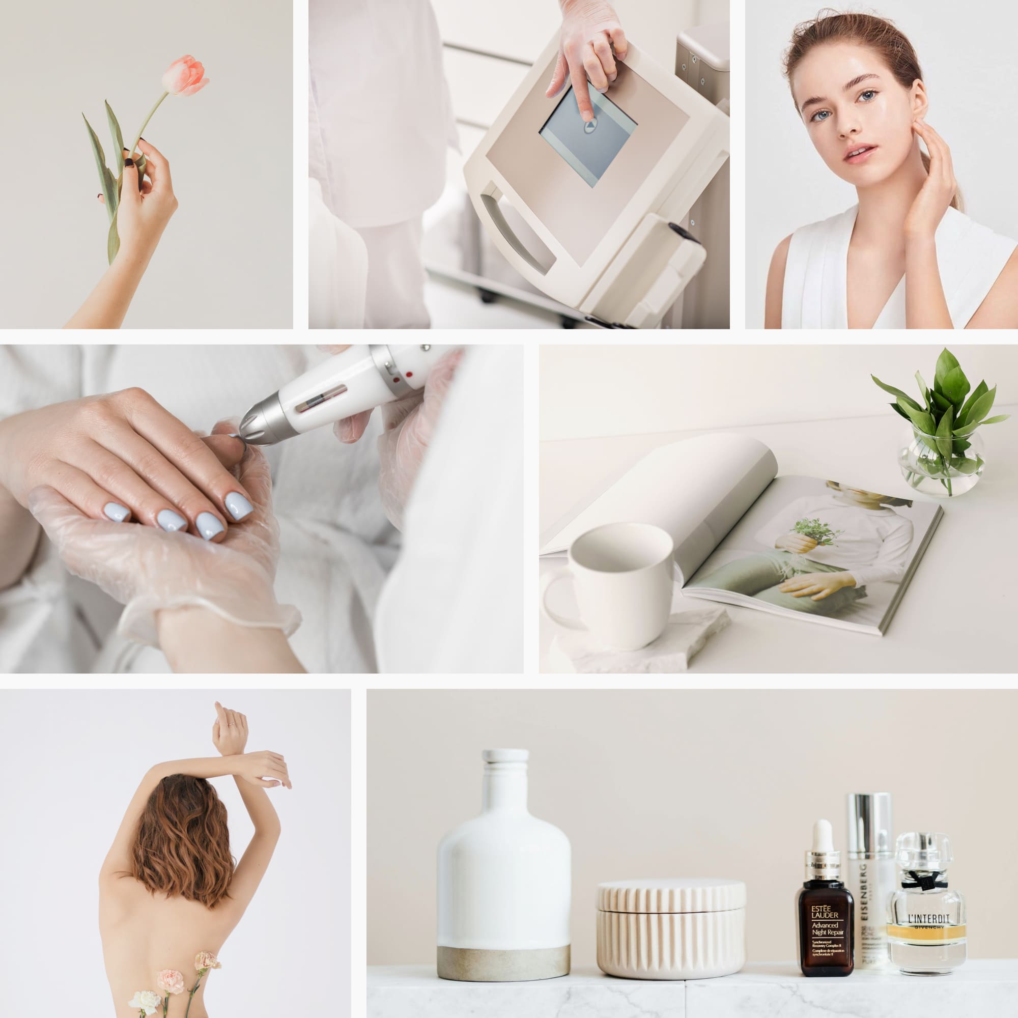
Imagery Style

Imagery Style

Imagery Style

Imagery Style

Imagery Style
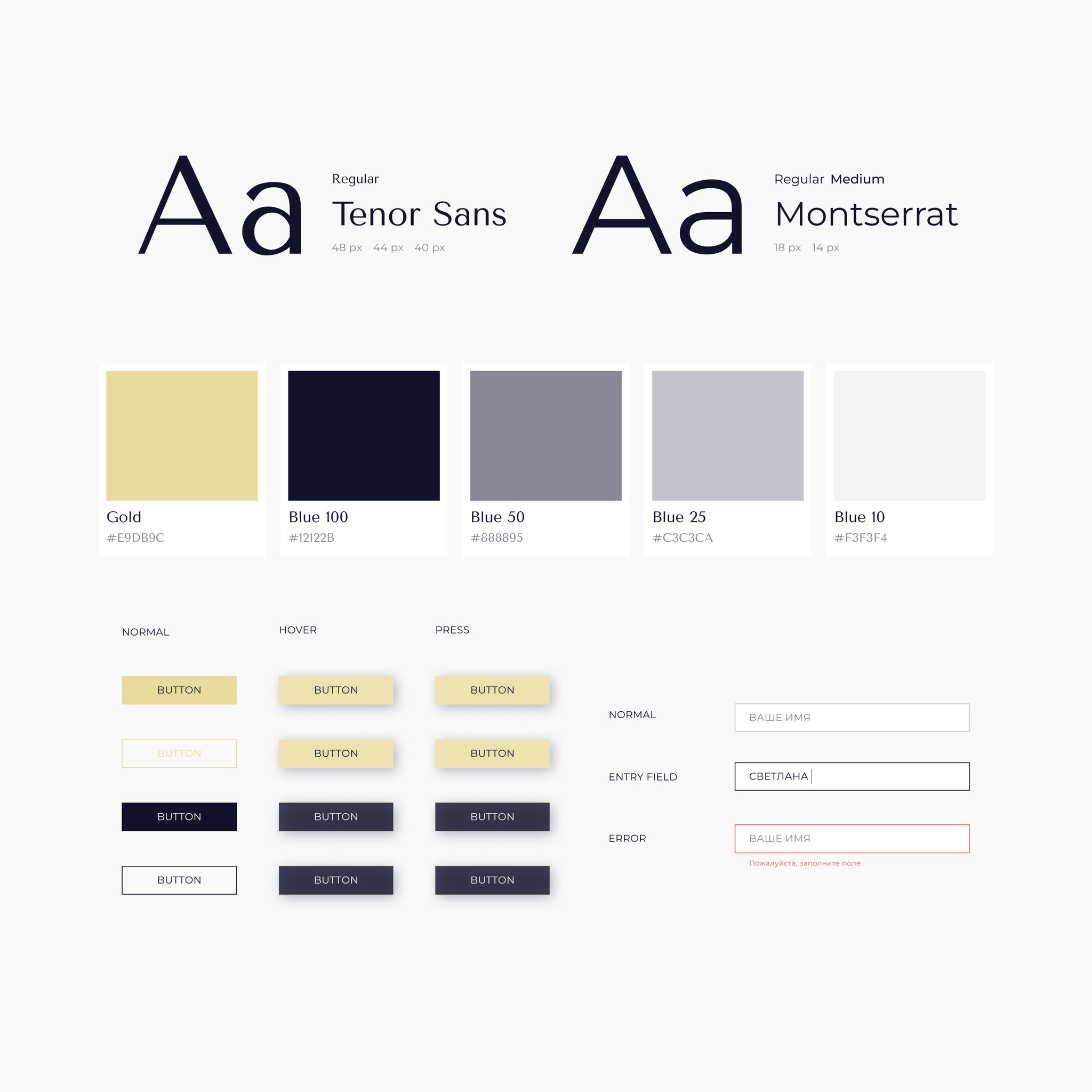
Visual Concept & Active Components

Visual Concept & Active Components

Visual Concept & Active Components

Visual Concept & Active Components

Visual Concept & Active Components
2. Well-thought-out structure
Highlight two main categories: About and Services. 'About' provides all necessary information about the clinic, while 'Services' details the procedures offered.
Divide the 'Services' into 'Face' and 'Body' categories, allowing clients to easily find treatments based on the area they want to work on.
Place the anti-aging medicine in the first-level menu as a priority service.
Include a search bar in the header, which expands by clicking the magnifying glass icon.

Hi-Fi Prototypes

Hi-Fi Prototypes

Website pages

Hi-Fi Prototypes

Hi-Fi Prototypes
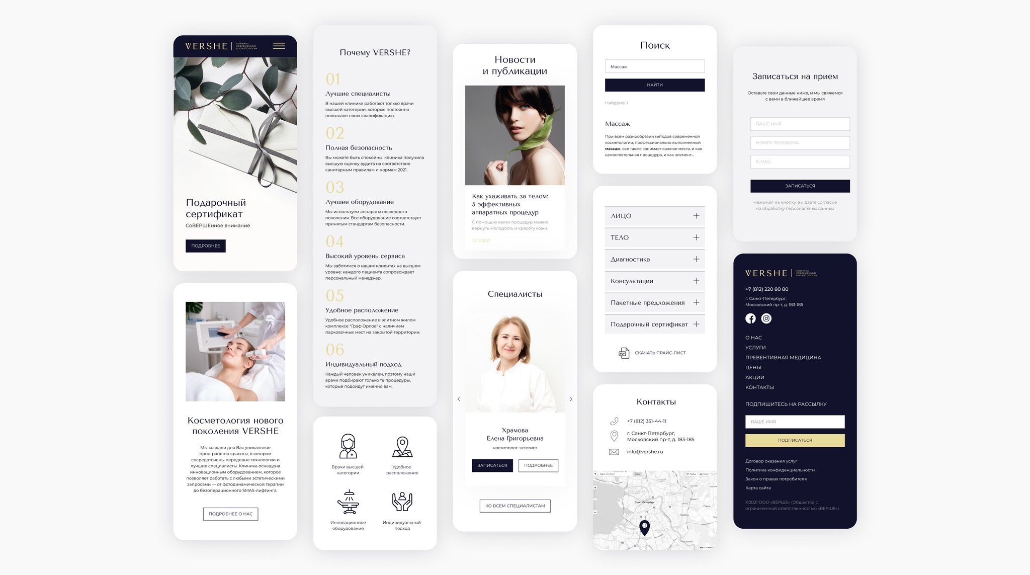
Mobile Design

Mobile Design

Mobile Design

Mobile Design

Mobile Design
3. Clear CTAs and contact information
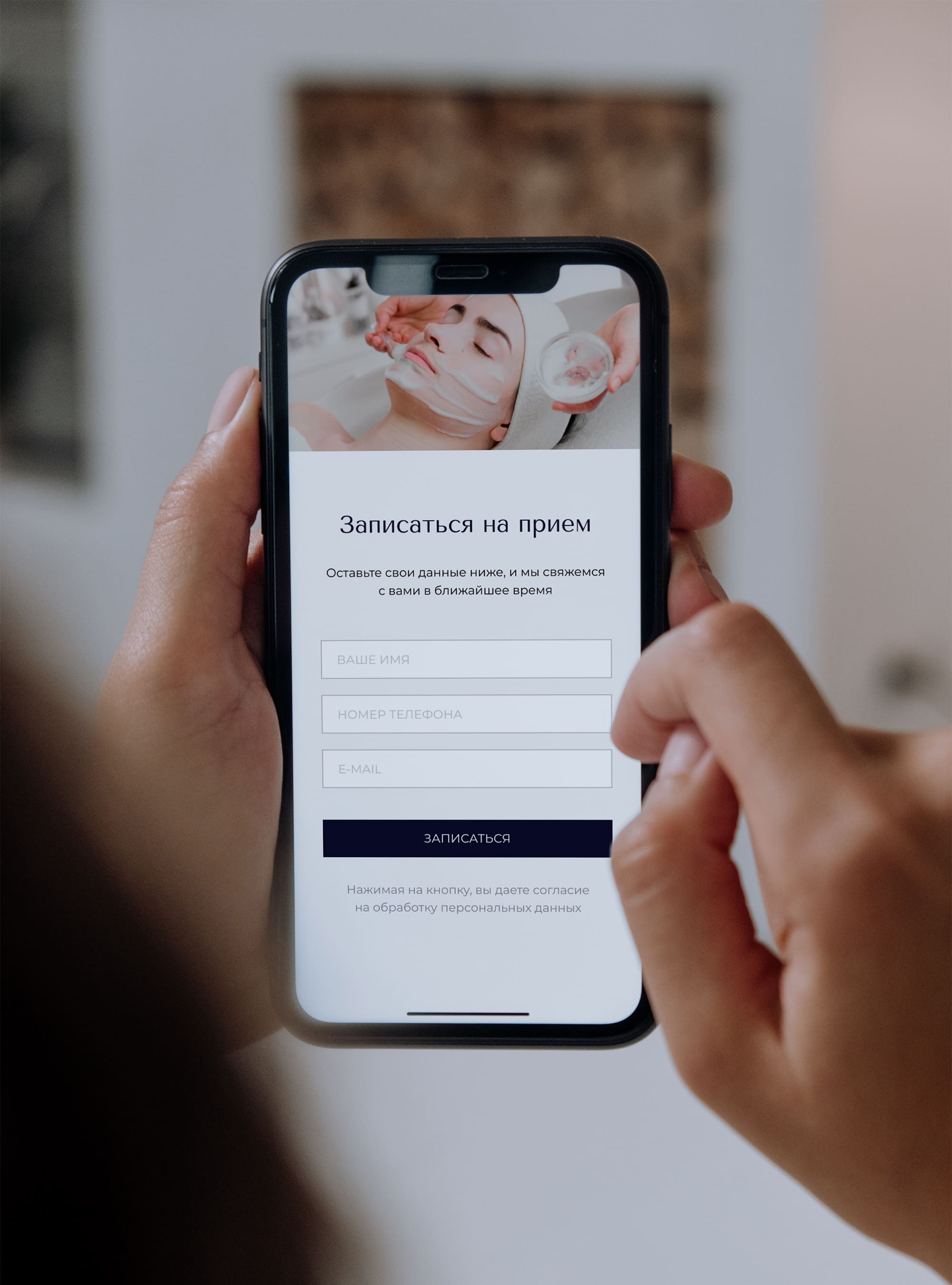
Add a 'Make an appointment' button to the header, which opens the enquiry form. Highlight it with the gold color.
Add a short inquiry form at the end of each webpage to prompt visitors to take action while navigating.
Offer all essential contact details on one page 'Contacts', and add short videos for locating the clinic.

Website Navigation

Website Navigation

Website Navigation

Website Navigation

Website Navigation
Result
Result
Result
Result
Result
ENGAGEMENT
We developed a site design with a carefully planned structure and clear, consistent user communication. The layouts were then passed to the developer, who transformed them into a fully functional site.
ENGAGEMENT
We developed a site design with a carefully planned structure and clear, consistent user communication. The layouts were then passed to the developer, who transformed them into a fully functional site.
ENGAGEMENT
We developed a site design with a carefully planned structure and clear, consistent user communication. The layouts were then passed to the developer, who transformed them into a fully functional site.
ENGAGEMENT
We developed a site design with a carefully planned structure and clear, consistent user communication. The layouts were then passed to the developer, who transformed them into a fully functional site.
ENGAGEMENT
We developed a site design with a carefully planned structure and clear, consistent user communication. The layouts were then passed to the developer, who transformed them into a fully functional site.
LEARNINGS & IMPRESSIONS
This was one of my first major projects as a UX/UI designer, making it a valuable learning experience. If I had to sum up what I learned in one word, it would be foresight.
Given the tight deadlines, I worked in parallel with the developer, handing over layouts as soon as they were completed. This led to challenges: while working on new pages, there was often a temptation to revise the overall structure, but by that point, the developer had already begun implementing the layouts. Additionally, I didn't have finalized content for some pages, which also complicated the work process and could have limited the client in terms of the desired content. Therefore, I had to take these facts into account, create a flexible design, and make decisions on various issues regarding the structure and content of the pages.
